The most overlooked branding issue in growing companies is not creativity but structural clarity.
Well-managed businesses with strong operations still look fragmented because their visual identity lacks discipline.
In competitive markets, evaluation begins visually.
Customers notice. They compare. They decide.
Confusion about logo variations creates inconsistent branding.
Inconsistent branding creates a quiet fear of looking unprofessional.
That fear weakens credibility before messaging has the chance to perform.
Soon, a practical question surfaces inside leadership discussions:
How many logos should a business have to support long-term growth without diluting recognition?
This is not a stylistic debate. It is a structural one.
Research published in SHS Web of Conferences found that simplified and consistent visual identity enhances brand recognition in digital environments, improves consumer memory and brand associations, and reinforces perceived professionalism across platforms.
The study also emphasizes that reducing unnecessary visual complexity strengthens cross-platform consistency and supports long-term competitiveness in dynamic markets.
The implication is direct.
Visual structure influences interpretation before strategy is evaluated.
Consistency = Recognition = Trust = Revenue
Paul Rand explains it clearly:
“Design is the silent ambassador of your brand.”
If that ambassador appears different in every interaction, confidence does not compound. It fragments.
This guide examines how structured logo systems eliminate confusion, restore consistency, and turn visual clarity into long-term brand authority.
Key Takeaways
- Brand consistency matters more than the number of logo versions.
- Most growing businesses need 3–5 structured logo variations.
- A logo suite prevents distortion, cropping, and inconsistent branding.
- Vector files and brand guidelines are essential for scalability.
- Controlled flexibility strengthens recognition and long-term growth.
Why Is Brand Consistency More Important Than Logo Quantity?
Many startups launch with a single logo file and assume it will cover every need.
It rarely does.
As soon as the brand appears across a website header, a social media profile, a pitch deck, and packaging, limitations begin to surface. Proportions fail. Legibility drops. Cropping becomes unavoidable.
Effective startup logo design anticipates this growth from day one.
A functional startup logo system typically includes:
- Primary logo for full brand representation
- Secondary logo layout for constrained horizontal or vertical spaces
- Submark for compact placements such as social avatars and merchandise
- Proper vector logo files in formats like SVG, EPS, or AI for unlimited scaling in digital and print environments
Vector logo files are essential because they allow resizing without quality loss, whether the logo appears on a mobile screen, a storefront sign, or large-format print.
When founders evaluate how many logos a business has, the startup’s answer is consistent: build for scalability early rather than redesign later.
Rebuilding a brand identity after launch often requires replacing website assets, marketing materials, packaging files, signage, and internal documents. That process is significantly more expensive and disruptive than designing a scalable system from the beginning.
Startups do not need more logos.
They need the right structure before growth exposes the gaps.
Why Is There So Much Confusion About Logo Variations?
Most founders ask:
- Should a business have multiple logos?
- How many logo versions does a business need?
- How many logos in a brand identity actually make sense?
The confusion exists because many businesses treat logos as artwork rather than infrastructure.
A logo is not a decoration.
It is part of a structured brand identity system.
According to the American Institute of Graphic Arts, brand identity systems require consistency across applications to maintain recognition and trust. When brands misuse or stretch logos across platforms, brand recognition declines.
That is not a theory bit branding discipline.
What Is a Logo Suite and Why Does It Matter?
A logo suite is a coordinated set of logo variations built to function together as a unified identity system.
It exists to protect three critical assets:
- Recognition, by ensuring the brand appears consistently across all touchpoints
- Usability, by providing properly formatted versions for digital and print environments
- Logo scalability, by maintaining clarity and proportion at every size
Most professional logo suites include a primary logo, a secondary layout, a submark, and an icon or favicon variation.
Each version serves a specific purpose.
Without structured logo variations, businesses encounter predictable operational problems:
- Logos cropped awkwardly for Instagram profile images
- Designs that lose legibility on mobile screens
- Distorted proportions on print banners and signage
- Inconsistent digital and print logo formats across teams
These issues are not creative flaws but system failures.
A scalable brand system prevents distortion, preserves recognition, and supports consistent branding across platforms.
This is why professional logo design includes structured deliverables inside a brand identity package, not just a single exported file.
Insert Infographics Here: Brand Guidelines Essentials Checklist
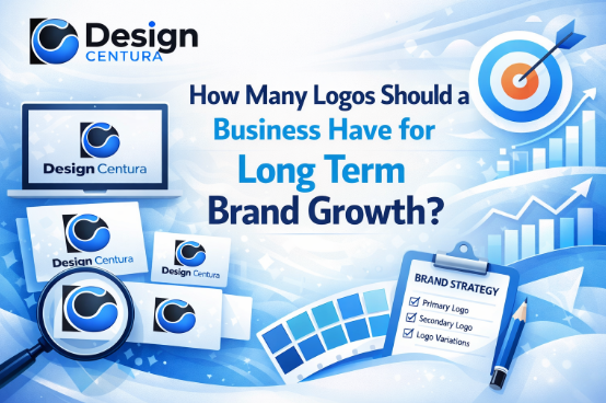
How Many Logos Should a Business Have?
The short answer:
Most growth-focused businesses need three to five purposeful logo variations inside a coordinated logo suite.
Not for decoration. Not for creativity. But for functionality.
Each variation solves a specific placement problem.
A complete system typically includes:
- Primary logo: the full brand mark used on websites, proposals, signage, and official materials.
- Secondary logo: an alternative layout, often stacked or horizontal, designed for tighter spaces.
- Submark: a compact stamp-style version for social avatars, merchandise, and small applications.
- Responsive or simplified logo: a reduced version for mobile environments where space is limited.
- Icon or favicon: a minimal mark used in browser tabs, app icons, and small digital placements.
The exact number depends on where the brand appears.
If a company operates across a website, social platforms, email signatures, print materials, packaging, and possibly a mobile app, it will require more structured variations than a business using only one or two channels.
The goal is not to accumulate “more logos.”
The goal is to ensure the brand functions consistently across every major touchpoint, from Instagram profile icons to invoices to storefront signage, without distortion, cropping, or improvisation.
So when someone asks, “How many logos should a company have?” the strategic answer is simple:
| Enough to operate everywhere the brand appears, without compromising recognition. |
What Are the Essential Logo Variations a Business Should Have?
Below is a strategic breakdown.
| Logo Type | Purpose | Where It’s Used |
| Primary Logo | Main brand identifier | Website headers, official documents |
| Secondary Logo | Alternative layout | Social media banners, packaging |
| Submark | Compact stamp version | Profile photos, merchandise |
| Responsive Logo | Simplified for small screens | Mobile, app icons |
| Icon/Favicon | Minimal brand mark | Browser tabs, favicons |
This table clarifies what founders often misunderstand when asking how many logo variations are needed.
Who Actually Needs Multiple Logos?
The real question is not whether brands need more than one logo.
It is whether the brand operates in more than one environment.
If a business appears across:
- A website header
- Social media profiles
- Email signatures
- Print materials and packaging
- App icons
- Merchandise
Then, multiple logo variations are not optional. They are operational requirements.
Each environment imposes different spatial and technical constraints. A horizontal website header does not function the same way as a square Instagram avatar. A detailed mark that works on a brochure may lose clarity at a mobile icon size.
This is not about adding complexity but ensuring usability and consistent presentation across every touchpoint.
Well-established brands demonstrate this clearly. Nike is widely recognized for using both its wordmark and its simplified swoosh independently, depending on the application.
Google uses its full wordmark in formal contexts and a simplified “G” icon for compact digital environments.
These are not random changes.
They are controlled variations within structured identity systems.
Any company that operates across multiple platforms and materials requires the same strategic approach if it intends to maintain recognition and avoid looking fragmented.
What Happens If a Business Has Only One Logo?
Business growth demands consistency across every customer touchpoint.
When logos exist only as randomly exported files, teams improvise.
Files are resized incorrectly. Formats are mismatched. Applications become inconsistent.
That operational friction slows marketing execution and weakens brand perception.
Professional logo design solves this at the system level.
It ensures:
- Clear hierarchy between primary, secondary, and supporting marks
- Responsive logo flexibility for different screen sizes and placements
- Proper digital and print logo formats for web, signage, packaging, and documents
- A scalable brand system that functions consistently as the company grows
A complete brand identity package goes beyond logo artwork. It includes the structural components required for disciplined execution:
- Primary logo
- Secondary layout
- Submark
- Brand guidelines
- Defined color system
- Typography system
- Vector logo files for unlimited scaling and production accuracy
Each element exists for a specific reason. The variations solve placement constraints. The guidelines prevent misuse. The file formats ensure clarity in both digital and physical environments.
This is fundamentally different from generic logo design services that deliver a single exported image without usage standards, format structure, or scalability planning.
One approach produces artwork, and the other one builds infrastructure.
What Is the Risk of Overdesigning Logo Variations?
While too few logo versions create friction, too many create fragmentation.
Overdesign happens when businesses introduce new variations without a defined purpose, approval structure, or usage rules. What begins as flexibility turns into inconsistency.
Excessive or uncontrolled variations often result in:
- Different versions appearing across departments and platforms
- Competing visual styles that weaken recognition
- Confusion about which file is “official”.
- Slower execution due to constant clarification and correction
When teams store multiple “final” files, adjust spacing independently, or create alternative layouts to solve one-off problems, the logo system loses cohesion.
Brand recognition depends on the repetition of core visual elements. When those elements shift too frequently or without governance, memorability declines.
The solution is not minimalism for its own sake but discipline.
A structured logo suite limits variations to defined use cases, supports them with brand guidelines, and ensures that every version reinforces the same identity rather than competing with it.
Not one logo. Not endless variations. Controlled flexibility.
What Does a Complete Logo Structure Look Like?
A growth-ready logo system is built for flexibility, not decoration.
At a minimum, it includes three core components that allow the brand to function across most environments:
- Primary logo for official brand representation in headers, signage, and formal materials
- Secondary layout in horizontal or stacked form for constrained spaces
- Submark for compact placements such as social media avatars and merchandise
Beyond the baseline structure, a complete system typically adds:
- Icon or favicon version for browser tabs, mobile apps, and micro-scale digital use
- Monochrome variation for one-color production needs
- Light and dark background versions to preserve contrast and legibility
Each variation exists to prevent forced resizing, distortion, and inconsistent application. Together, they eliminate the need to crop, stretch, or improvise when the logo appears in different contexts.
This clarifies how many logos in a brand identity are required for practical flexibility.
In most real-world applications, the number is rarely fewer than three, and often closer to five or six when color and background adaptations are included.
Why Vector Logo Files Matter in This Discussion
Many branding problems are not caused by poor design but by poor file structure.
When a logo exists only as a raster image, such as a JPEG or PNG, it is built from fixed pixels.
Enlarging it reduces clarity. Edges blur. Details break down.
What looks sharp on a laptop screen can appear soft, distorted, or unprofessional when printed on signage, packaging, or merchandise.
Vector logo files work differently.
Formats such as AI, EPS, and SVG are built from mathematical paths rather than pixels. That structure allows the logo to scale infinitely without losing precision, whether it appears on a business card or a storefront sign.
Without vector source files:
- Large-format print loses sharpness
- Embroidery and vinyl cutting lose detail accuracy
- Production vendors request new files that do not exist
- Teams resort to resizing low-resolution exports
These issues are not cosmetic.
They affect manufacturing, marketing speed, and brand credibility.
A proper custom logo design project includes professional file delivery in multiple vector formats, along with correctly prepared digital exports for immediate use.
That combination ensures the brand performs consistently across digital screens, print production, packaging, and merchandise.
In discussions about how many logos a business should have, file structure is often overlooked.
But without the right foundation, even the most thoughtfully designed logo system cannot scale.
Who Should Reevaluate Their Logo System?
A business should reassess its logo system when execution starts breaking down in real-world applications.
Common warning signs include:
- Social media profiles using cropped or improvised versions of the logo
- Website headers that do not visually match print materials or packaging
- Email signatures, presentations, or documents displaying stretched or distorted marks
- Multiple teams are exporting their own versions because no approved master files exist
- Inconsistent colors, spacing, or proportions appearing across platforms
These are not isolated design mistakes.
They indicate the absence of a controlled system.
When teams cannot access proper formats, when variations are created on the fly, and when the logo appears differently depending on who applied it, the brand lacks logo scalability and operational discipline.
At that stage, the solution may involve strengthening brand guidelines, rebuilding the logo suite, or, in some cases, initiating a structured business logo redesign to restore consistency.
The key question is not whether the logo looks good in isolation.
It is whether it performs consistently everywhere it appears.
Case Studies
Case Study 1: Nike’s Structured Logo Evolution
Nike introduced the Swoosh in 1971, originally paired with the Nike wordmark as the company began building its identity.
Over time, the Swoosh gained widespread recognition and began appearing independently in many applications, a progression documented in Nike’s official brand history.
Source: Nike Swoosh Logo History – Nike Archives
This evolution was not the creation of multiple unrelated logos.
It was the controlled expansion of a single identity system. The core mark remained consistent while its usage adapted to context. In some placements, the wordmark reinforced the brand name. In others, the Swoosh alone carried recognition.
| Key Insight:
Nike did not multiply logos. It strengthened one identity and deployed structured variations as recognition matured. Brand recognition expanded because the system was scalable. |
Case Study 2: Google’s Responsive Logo System
In 2015, Google redesigned its visual identity to function in what it described as a “multi-screen world.”
The redesign introduced:
- A refined Google wordmark
- A simplified four-color “G” icon for compact environments
- Animated dots and dynamic elements for interactive contexts
Source: Evolving the Google Identity – Google Design
The redesign emphasized clarity, legibility, and adaptability across devices ranging from large desktop displays to small mobile screens.
Rather than relying on a single fixed logo, Google built a flexible identity system with controlled variations designed for different use cases.
This directly reflects the practical logic behind asking, “How many logo versions does a business need?”
Google’s approach demonstrates that the answer is not about quantity.
It is about ensuring the brand remains recognizable and functional across every environment in which it appears.
What Role Does Professional Logo Design Play?
As a business grows, logo problems rarely appear as creative failures. They show up as operational friction.
A marketing team needs a square version for social media, a printer asks for a high-resolution file, a developer requires an SVG for the website, and someone eventually stretches a low-quality export to make it “fit.”
What begins as a minor workaround becomes a visible inconsistency.
Professional logo design addresses this at the system level, not the aesthetic level.
It establishes a clear hierarchy between the primary logo, secondary layout, and submark so each version serves a defined purpose.
It incorporates responsive logo flexibility for small-screen environments and ensures proper digital and print logo formats for web, packaging, signage, and documentation.
The objective is not to produce more artwork, but to create controlled variations that function predictably across every placement.
A complete brand identity package reflects that logic. It typically includes a primary logo, a secondary layout, a submark, structured brand guidelines, a defined color system, a typography system, and vector logo files suitable for accurate scaling in both digital and physical production.
Each element exists to solve a constraint.
Variations address spatial differences. Guidelines prevent misuse. Correct file formats eliminate distortion.
This is fundamentally different from generic logo design services that deliver a single exported image without usage standards, scalable formats, or implementation rules. One approach produces a graphic asset.
The other builds a scalable brand system that supports execution, delegation, and long-term growth.
Files do not scale. Systems do.
How Many Logos in a Brand Identity for Startups?
Many startups launch with a single logo file and assume it will cover every need, but it rarely does.
As soon as the brand appears across a website header, a social media profile, a pitch deck, and packaging, limitations begin to surface.
Proportions fail. Legibility drops. Cropping becomes unavoidable.
Effective startup logo design anticipates this growth from day one.
A functional startup logo system typically includes:
- Primary logo for full brand representation
- Secondary logo layout for constrained horizontal or vertical spaces
- Submark for compact placements such as social avatars and merchandise
- Proper vector logo files in formats like SVG, EPS, or AI for unlimited scaling in digital and print environments
Vector logo files are essential because they allow resizing without quality loss, whether the logo appears on a mobile screen, a storefront sign, or large-format print.
When founders evaluate how many logos a business has, the startup’s answer is consistent:
| Build for scalability early rather than redesign later. |
Rebuilding a brand identity after launch often requires replacing website assets, marketing materials, packaging files, signage, and internal documents. That process is significantly more expensive and disruptive than designing a scalable system from the beginning.
Startups do not need more logos.
They need the right structure before growth exposes the gaps.
Conclusion
The question “how many logos should a business have” is ultimately a question about application, not quantity.
Most growing companies require a primary logo, a secondary layout, and a compact variation capable of functioning across digital and physical environments. Additional versions exist only to solve defined placement constraints, not to increase variety.
A single inflexible logo restricts execution. Uncontrolled variations weaken recognition. Long-term brand growth depends on a governed system that balances flexibility with consistency.
When evaluating how many logos a company should have, the correct answer is determined by where the brand must perform and whether clear usage standards support each version.
Businesses that scale successfully treat their visual identity as infrastructure. They invest in structured logo systems, professional file preparation, and disciplined application.
Growth is sustained by consistency.
Consistency is sustained by structure.
If your current logo feels adequate but uncertain under expansion, a structured evaluation can reveal whether it is built for long-term performance. Design Centura provides strategic brand audits designed to assess scalability, cohesion, and execution readiness.
For a professional review of your logo system, contact info@designcentura.com or call 323-283-8729 to begin the conversation.
FAQs
1. What is a logo suite?
A logo suite is a structured collection of coordinated logo variations designed to function across different placements. It typically includes a primary logo, a secondary layout, a submark, and supporting formats for digital and print use.
2. What is the difference between the primary and secondary logos?
The primary logo is the main brand mark used for official visibility, such as website headers and signage. A secondary logo is an alternate layout, often stacked or simplified, designed for tighter spaces where the primary version does not fit properly.
3. Why do brands have logo variations?
Brands use logo variations to maintain consistency across platforms with different sizes and format constraints. Variations prevent cropping, distortion, and legibility issues while preserving recognition.
4. What is included in a brand identity package?
A brand identity package typically includes a primary logo, secondary variations, submarks, color systems, typography selections, brand guidelines, and properly prepared digital and print-ready files.
5. How many logo concepts do agencies provide?
Most professional agencies present two to four initial logo concepts based on strategic direction. The focus is not on volume, but on developing a concept aligned with positioning, audience, and scalability.
6. What does custom logo design with brand guidelines involve?
Custom logo design with brand guidelines includes creating tailored logo variations along with documented usage standards such as spacing, color rules, file formats, and background restrictions to ensure consistent implementation.
7. What professional logo design services does Design Centura offer?
Design Centura provides structured logo systems that include primary and secondary layouts, submarks, vector file delivery, and comprehensive brand guidelines to ensure long-term scalability and consistency.
8. How does Design Centura approach a logo suite for growing businesses?
Design Centura develops logo suites based on application needs, ensuring each variation serves a defined purpose. The process focuses on scalability, disciplined usage, and cohesive brand presentation across digital and physical environments.